
I left the live homepage alone and prepared three private directions beside it. The content and identity stayed the same. Only the emphasis changed. That constraint mattered. One version kept the familiar structure, one gave practical articles and work notes more room, and one spoke more directly about the problems I help people solve. I could compare three different promises without confusing the decision with colour, spacing or whatever happened to look modern. The website already had useful material. My job was to decide what a visitor should meet first.
Three directions exposed three different promises
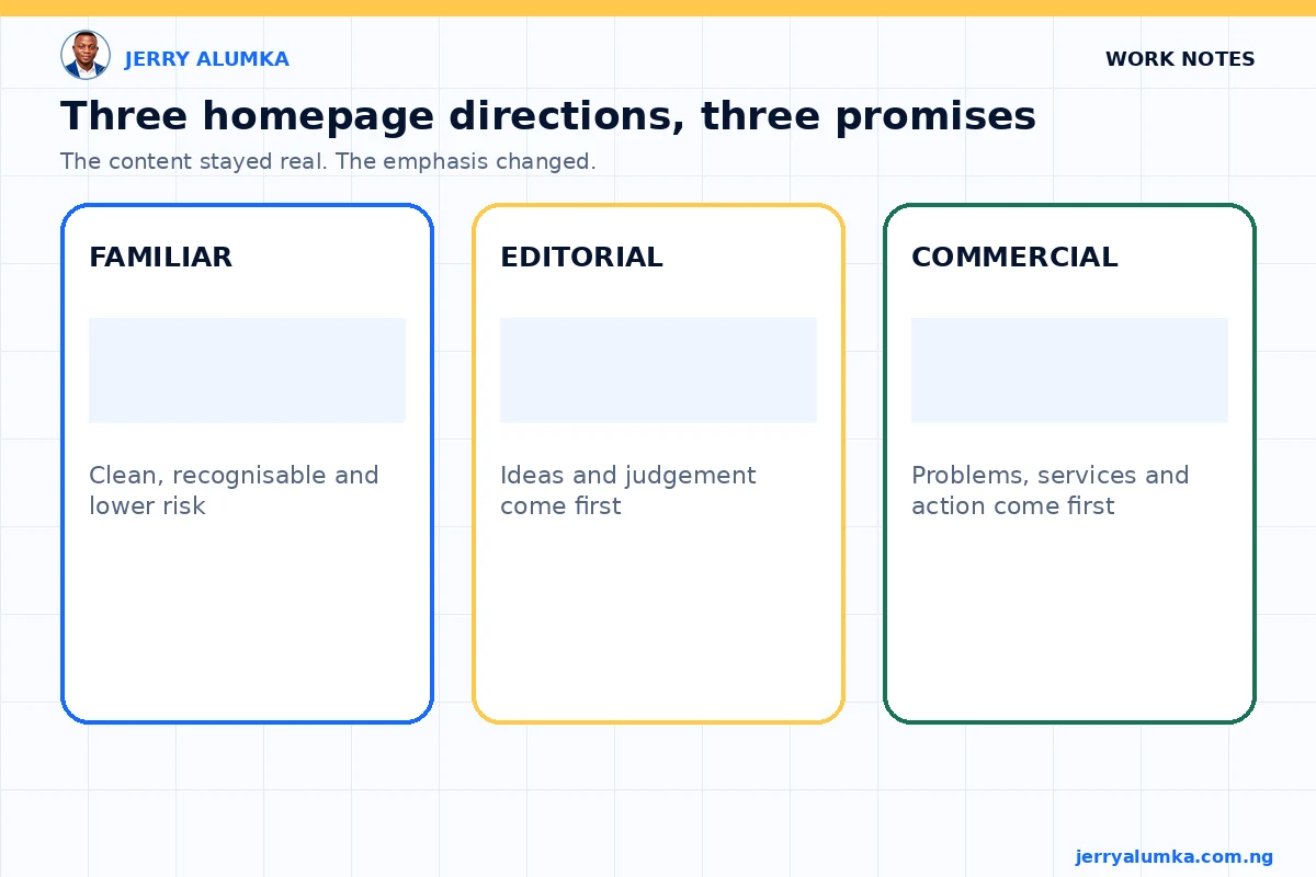
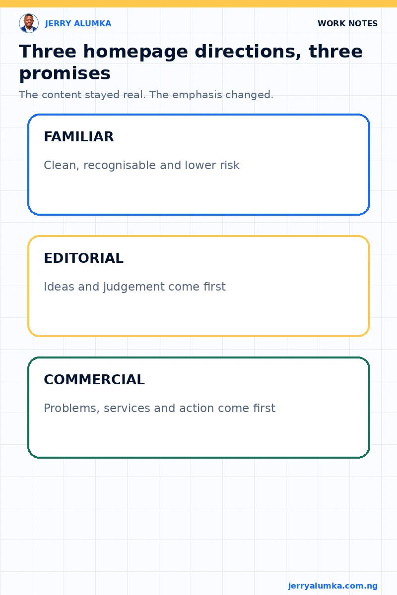
The first direction was conservative. It kept the existing structure recognisable, but made it cleaner and shorter. It was the lowest risk because a returning visitor would still know where everything belonged.
The second direction treated the site more like an editorial home for practical ideas. It gave more weight to articles, work notes and judgement. The third was bolder and more commercial. It presented me as a Nigerian operator who helps people solve marketing and business system problems.
None of the three was a new coat of paint. Each version answered a different positioning question. If I had started by adjusting the live homepage section by section, those differences would have remained hidden inside small design discussions.
I reviewed the decision, not the decoration
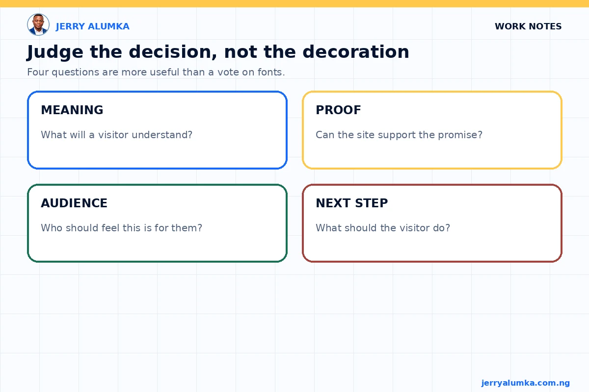
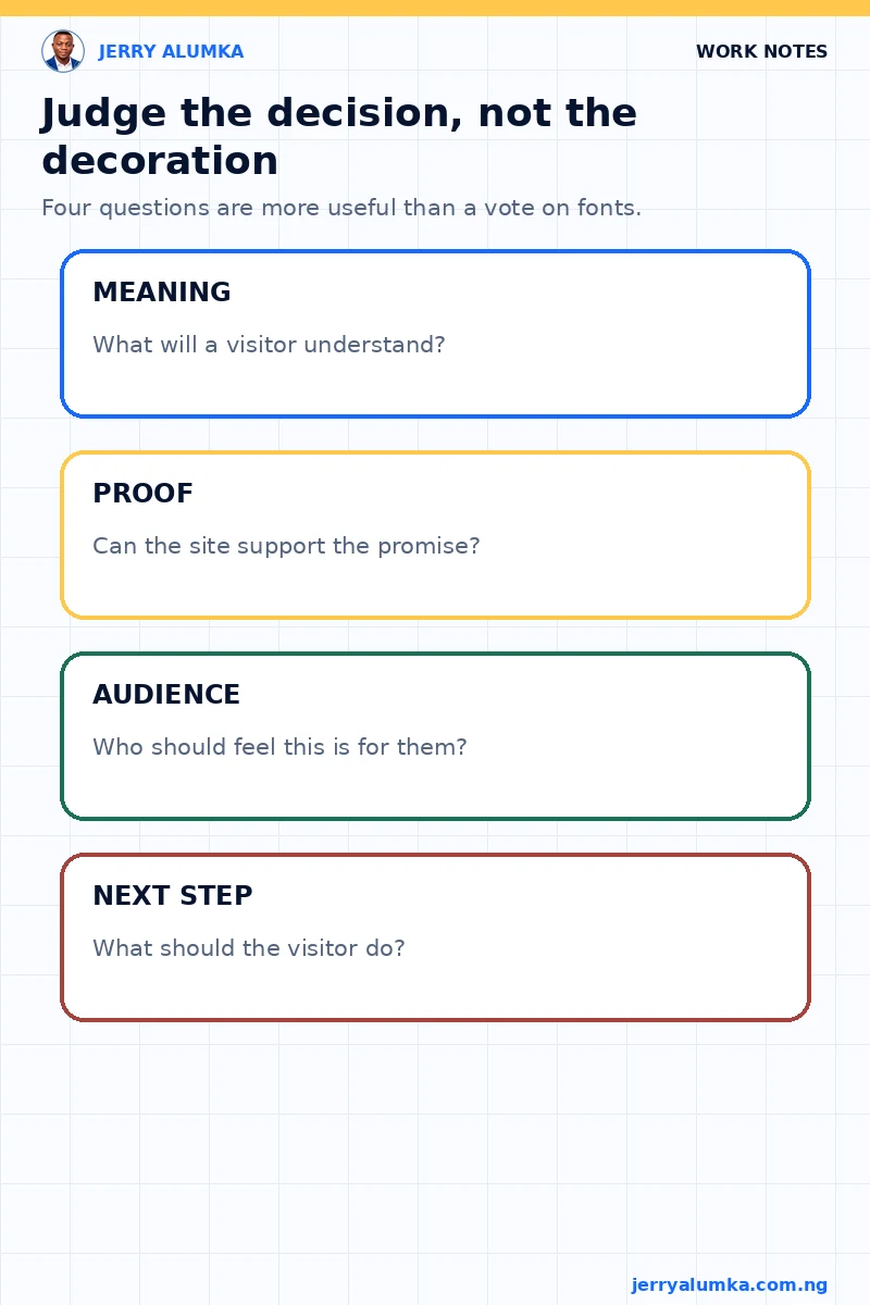
I didn’t ask which page looked nicest. That question is too loose. A beautiful homepage can still communicate the wrong thing.
I reviewed what a first-time visitor would understand quickly. What am I known for? Which work receives attention first? Does the page feel relatable without making the work look lightweight? Is there a clear next step for someone who wants to learn from me or work with me?
I also checked whether each direction was built on real evidence. The articles, services and examples had to exist. I didn’t want a more impressive design to create a more impressive version of me that the rest of the site could not support.
That changed the review. The choice became a decision about emphasis, proof and audience, rather than a vote on fonts.
I kept the live homepage untouched
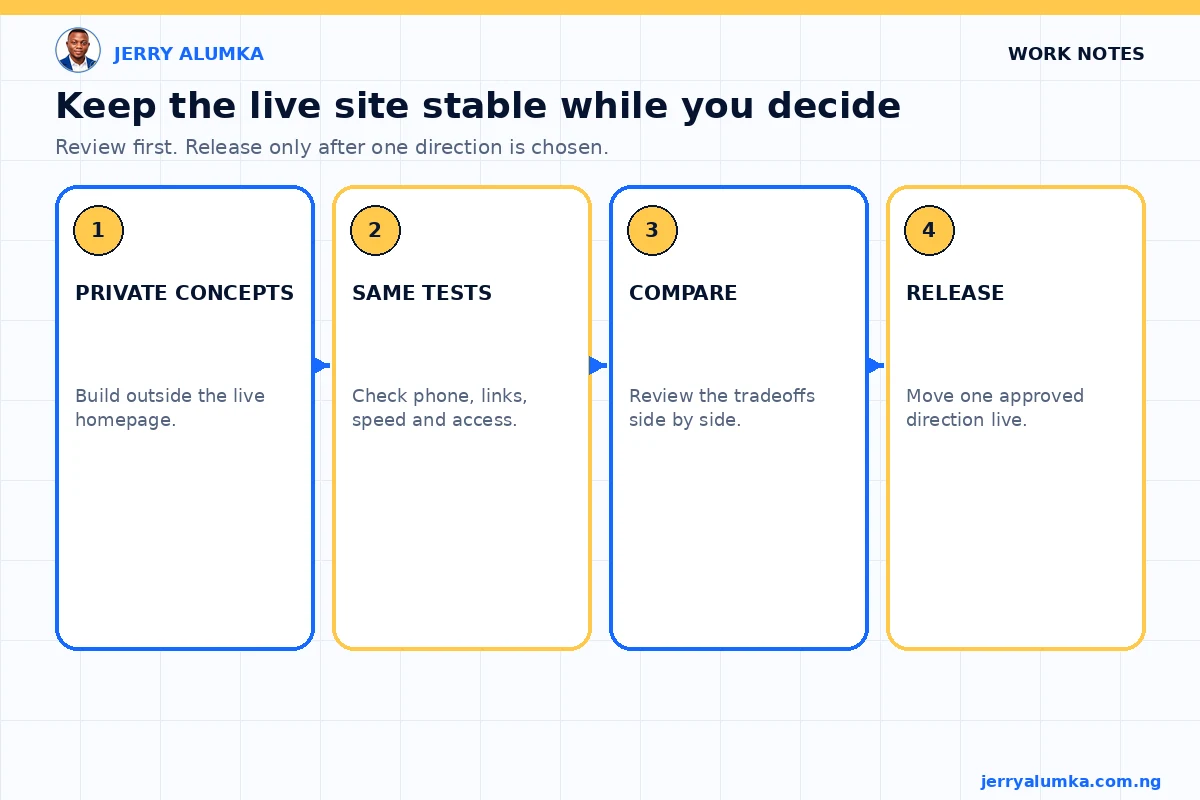
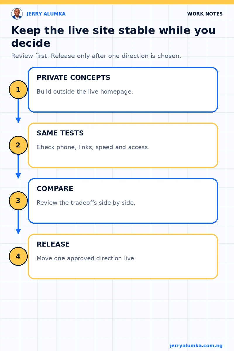
A comparison is only useful when it doesn’t damage the working site. I published the concepts in a private review area, blocked them from search indexing and left the current homepage alone.
I then tested the concepts on phone, tablet and desktop sizes. I checked links, page speed, accessibility, tap targets and sideways scrolling. A direction that works only on a large laptop isn’t a serious option, especially when many Nigerian readers will first open the page on a phone.
This separation also made disagreement cheaper. If one direction was wrong, I could reject it without undoing a live release. The website remained stable while the strategic choice stayed open.
Three options were enough
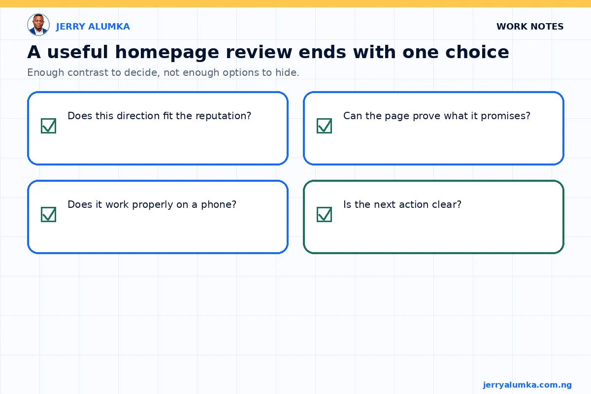
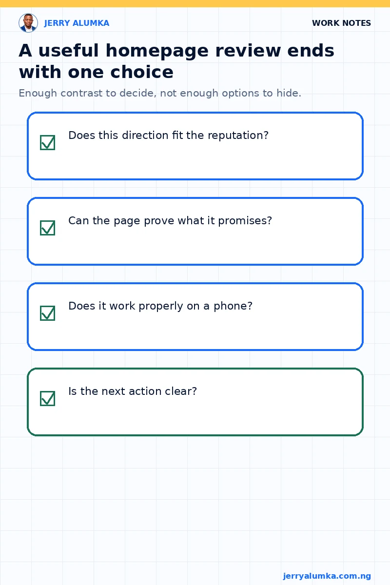
Three directions are useful. Ten would become another form of avoidance. I needed enough contrast to expose the decision, not so many options that the decision disappeared.
My review rule is now simple. Keep the content evidence consistent, change the strategic emphasis, test each direction under the same conditions and choose the version that best matches the reputation I am trying to build.
The final direction hasn’t been released yet. That uncertainty is part of the work. The useful outcome at this stage is that the choice is now visible. I can explain what each option gains, what it gives up and what a visitor is likely to remember.
When I eventually change the homepage, I want to be able to explain the choice in terms of what a visitor will understand and remember. “It feels more modern” is not enough.