
The easy move was to create another landing page and send out a fresh review link. I decided against it. The existing page already had the right audience and purpose. Its problem was narrower: buttons describing the same next step in different ways. A second page would have hidden that inconsistency inside a new URL and left two versions to manage. I corrected the page people were already reviewing, then checked that one action and one dependable address carried through the release.
A fresh link would have moved the confusion
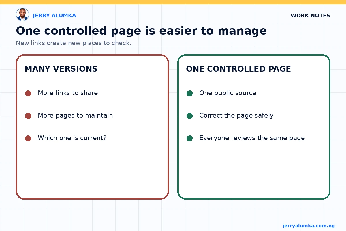
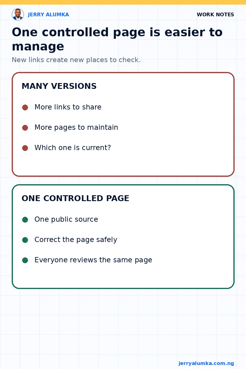
A new page can feel safer because it protects the previous version. It also creates a second place that needs to be checked, shared and maintained. Soon, one person is reviewing the old link while another person is commenting on the new one. A correction that should simplify the work starts producing version confusion.
This matters in marketing because a landing page is connected to more than its design. Links may sit inside adverts, messages, reports, bookmarks or internal documents. If the team keeps creating new URLs for every correction, it becomes harder to know which page is current and where a visitor will land.
I use a simple rule here. If the page has the right purpose and the problem can be corrected safely, improve the same page. Create a new page only when the audience, offer or job of the page has genuinely changed.
I reduced the page to one action
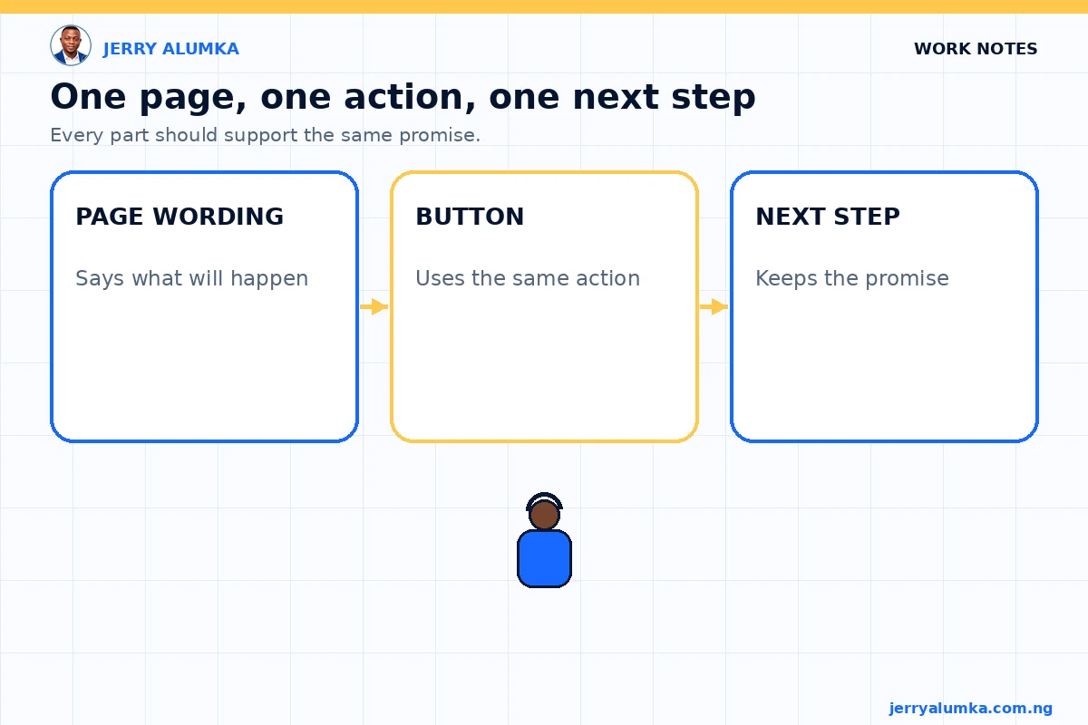
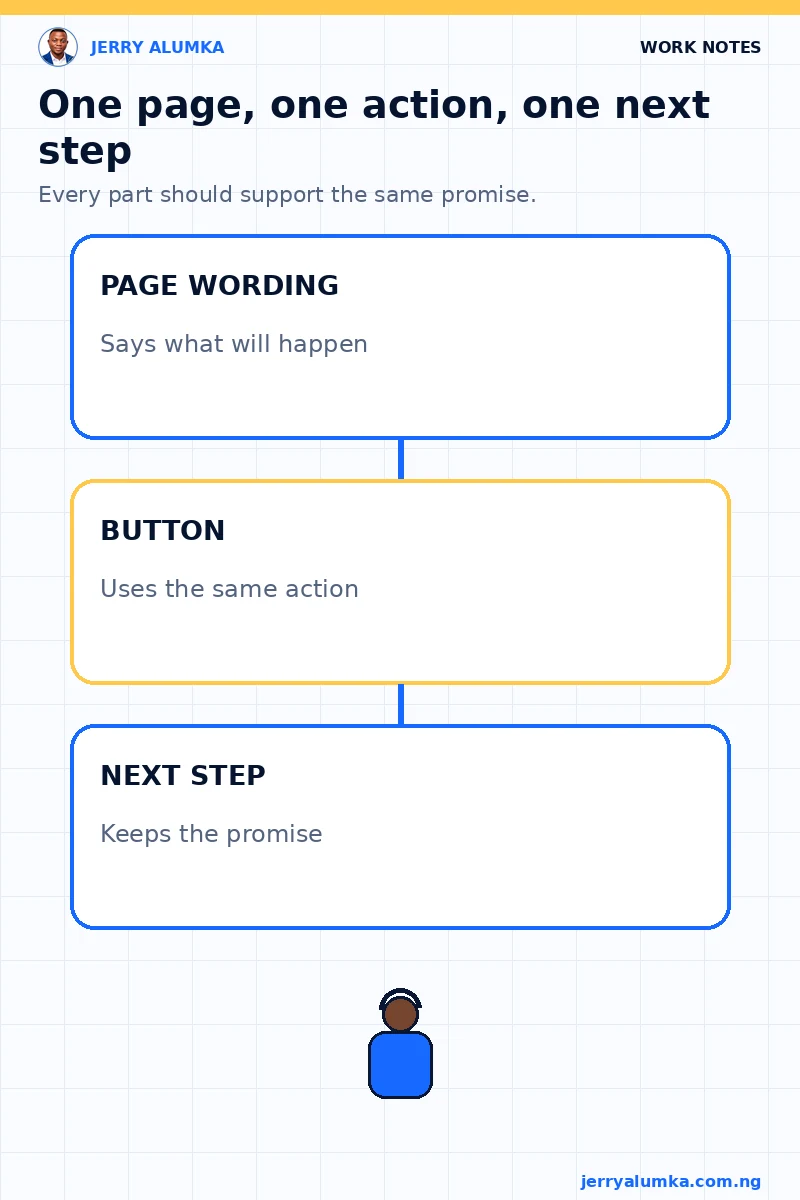
The wording problem wasn’t just cosmetic. A call to action tells the visitor what will happen after a click. When different buttons use different phrases for the same step, the visitor has to stop and work out whether the actions are actually different.
I chose one phrase and applied it consistently. The visible wording, button destination and surrounding explanation all had to support the same next step. The design also had to make the main line easy to scan without turning one button into two separate instructions.
Consistency doesn’t mean repeating a phrase carelessly. It means the page makes one promise about the next step, then keeps that promise everywhere the visitor can act.
I changed the same URL and checked both screen sizes
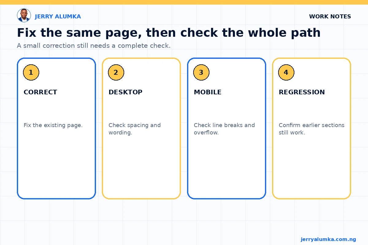
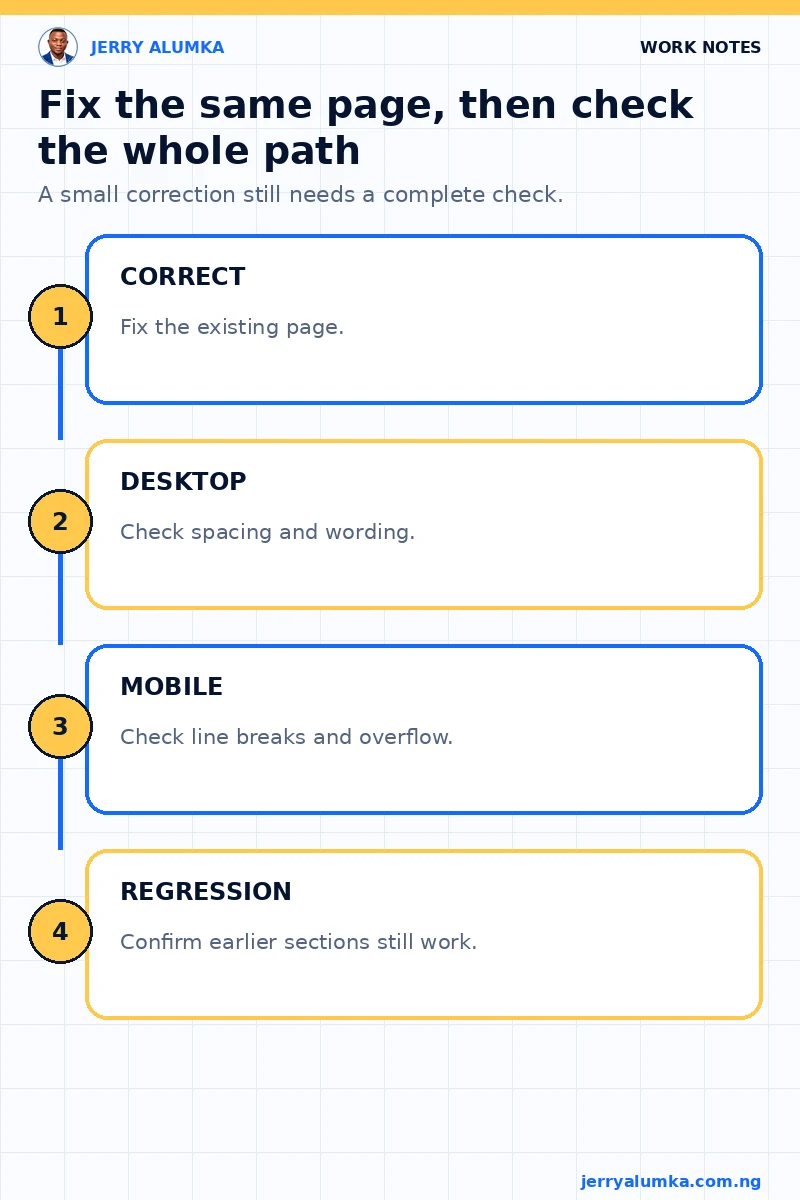
Fixing the copy was only the first part. The button layout had to work on a phone and on a larger screen. A neat desktop button can become cramped on mobile. A line break can make two related words look like separate choices. A wider button can also push the page beyond the screen and create sideways scrolling.
After the change, I checked the clean page at both screen sizes. I looked for the same wording in every call to action, readable spacing, a clear visual order and no horizontal overflow. I also checked that earlier sections of the page still looked right. A small correction should not quietly damage another part of the page.
The ordinary URL had to show the change
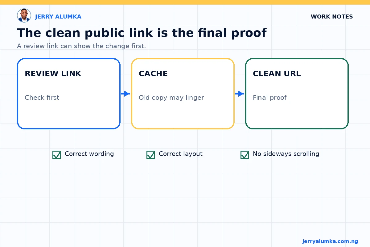
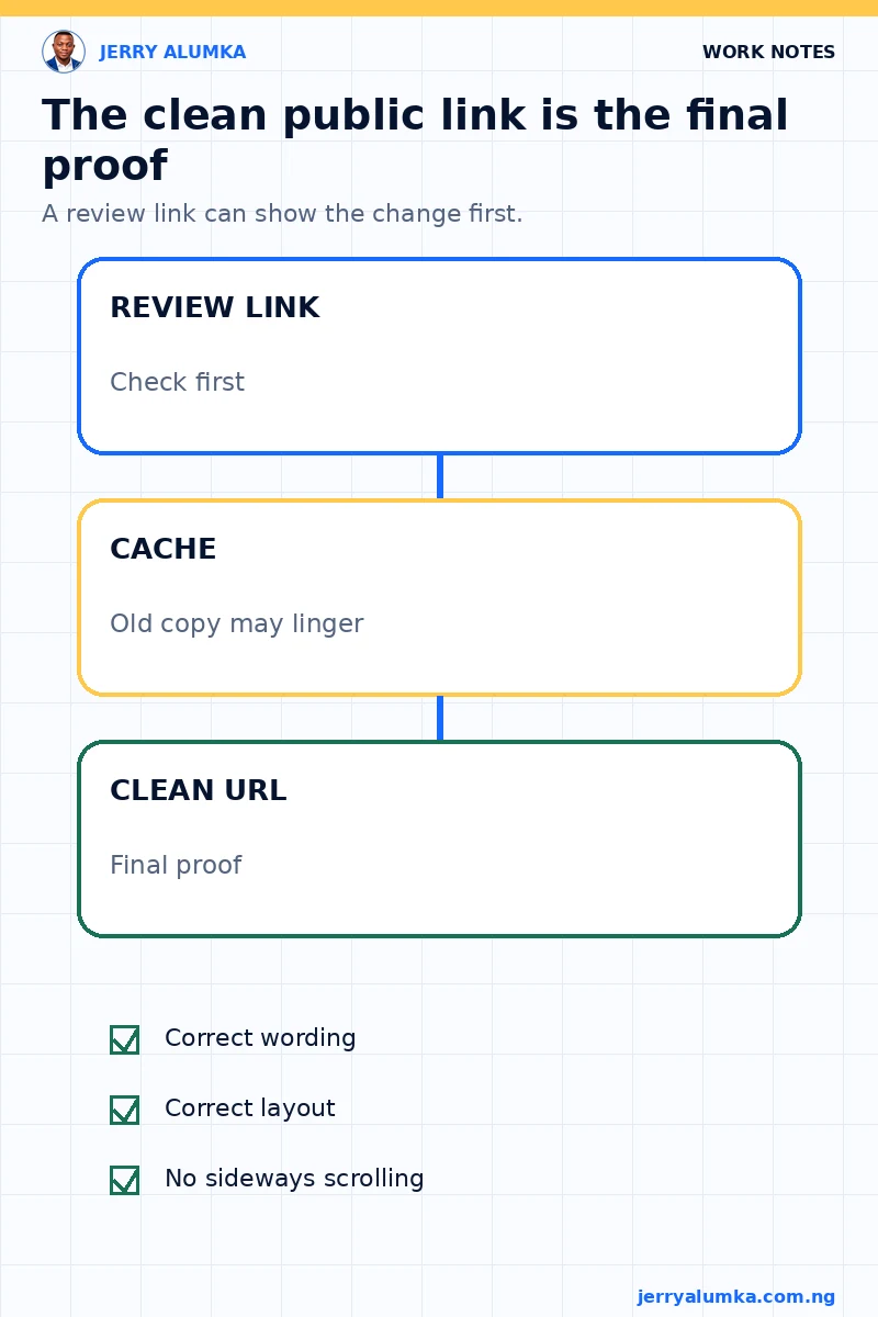
The updated review link showed the correction first, but the normal page address took longer to show it because an older copy was still being served from cache. A cache stores a temporary copy of a web page so it can load faster. That speed is useful, but it can also make a completed change look unfinished.
I didn’t treat the review link as final proof. I waited until the ordinary clean URL showed the new wording and layout without any special addition to the address. Only then could I say the page itself had been updated.
I now treat a new page as a separate marketing decision, not a convenient way to avoid editing the current one. If the audience, offer and purpose are still the same, I would rather correct the public source and test it properly. That keeps the team looking at the same thing and gives the visitor one dependable path.