
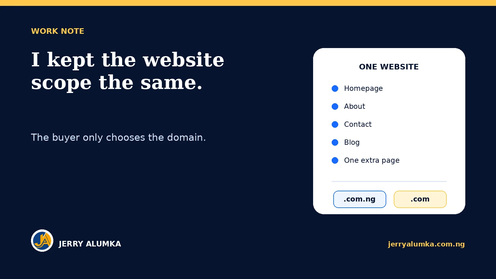
Today I worked on a basic website offer for small Nigerian businesses. The first version could easily have become a long list of features, technical terms and optional extras. That would have made the offer look bigger, but it would not have made the buying decision easier.
I chose a simpler structure. The website scope stays the same. A client pays ₦60,000 for a .com.ng website or ₦70,000 for a .com website. The difference is the domain extension, not a weaker or stronger version of the work.
That sounds like a small pricing choice. It changed the whole page.
I separated the buying choice from the website scope
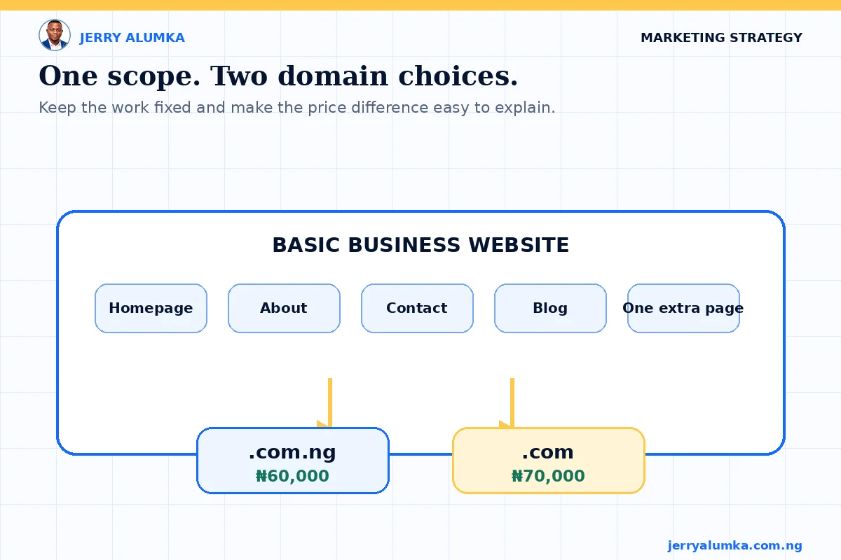
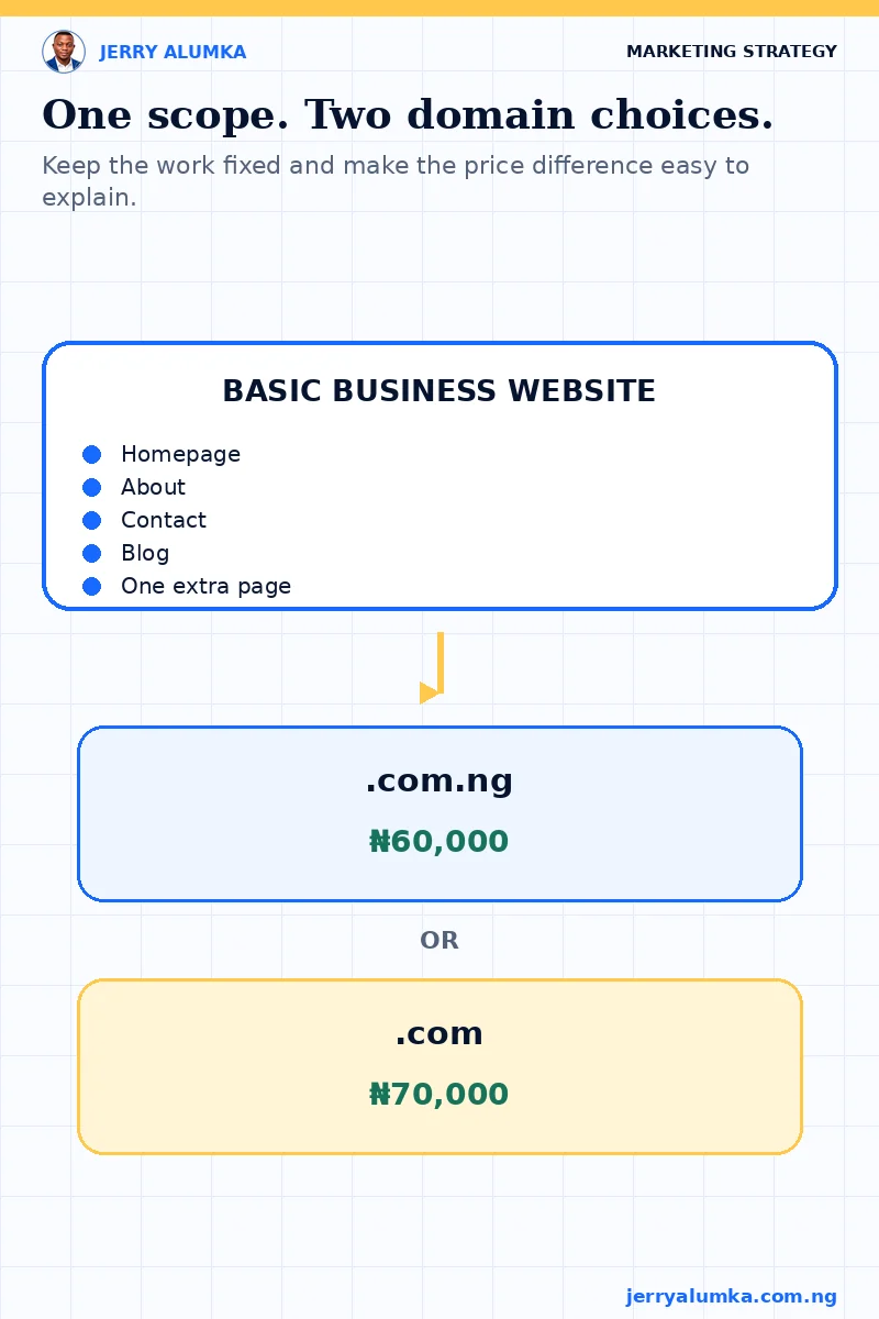
A small business owner should not need to compare several confusing packages before knowing what is included. Both options cover the same practical website: a homepage, About page, Contact page, blog and one additional page chosen for the business.
The domain choice sits on top of that fixed scope. A .com.ng address costs less and clearly connects the business to Nigeria. A .com address costs more. The client can choose the address that suits the business without wondering whether the cheaper option comes with an inferior website.
This also keeps the sales conversation honest. I do not need to remove useful pages from one package so another package can look premium. The price difference has a clear reason that a buyer can understand.
I wrote the offer around what the owner gets
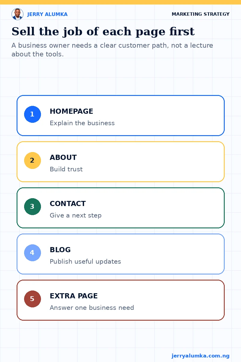
It is easy for a website builder to lead with hosting, SSL, responsive layouts and content management. Those things matter, but most business owners do not start there. They want customers to find credible information, understand what the business does and have a clear way to call, send a message or make an enquiry.
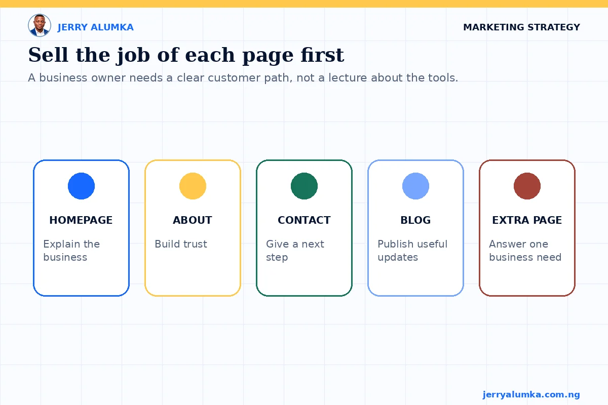
I kept the technical items on the page, but I did not let them carry the main argument. The offer explains the job of each page. The homepage introduces the business. The About page builds trust. The Contact page gives people a direct next step. The extra page can explain services, products, a portfolio or another part of the business that customers need to see.
That order matters. People buy the usefulness of the website before they inspect the tools used to build it.
A fixed boundary protects the client and the work
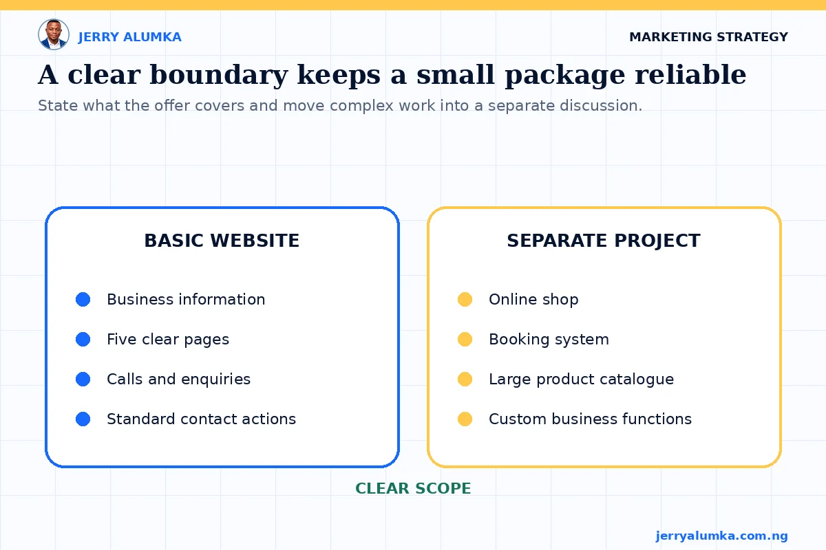
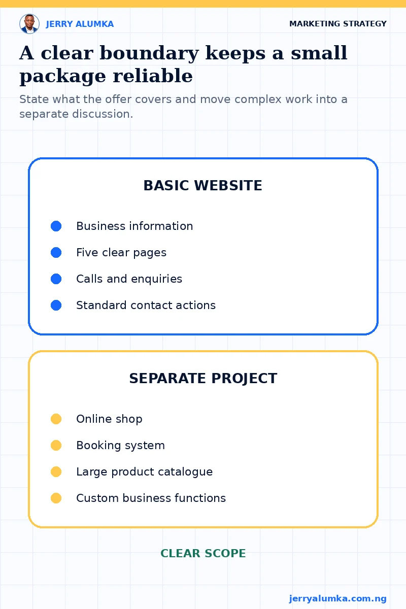
A simple package still needs limits. Without them, one additional page can quietly become a product catalogue, a booking system or a full online shop. The buyer then expects much more work at the original price, while the builder struggles to deliver properly.
I made the boundary visible. This is a basic informational website for a business that needs a professional online presence. More complex functions need a separate discussion and price. That is not a hidden restriction. It is part of making the offer reliable.
A good boundary helps both sides. The client knows what will be delivered. I can plan the work, keep the price credible and avoid promising a larger system under a small package name.
The page still had to prove the offer in public
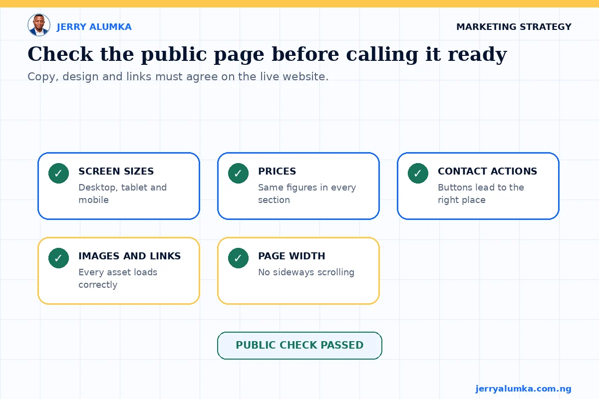
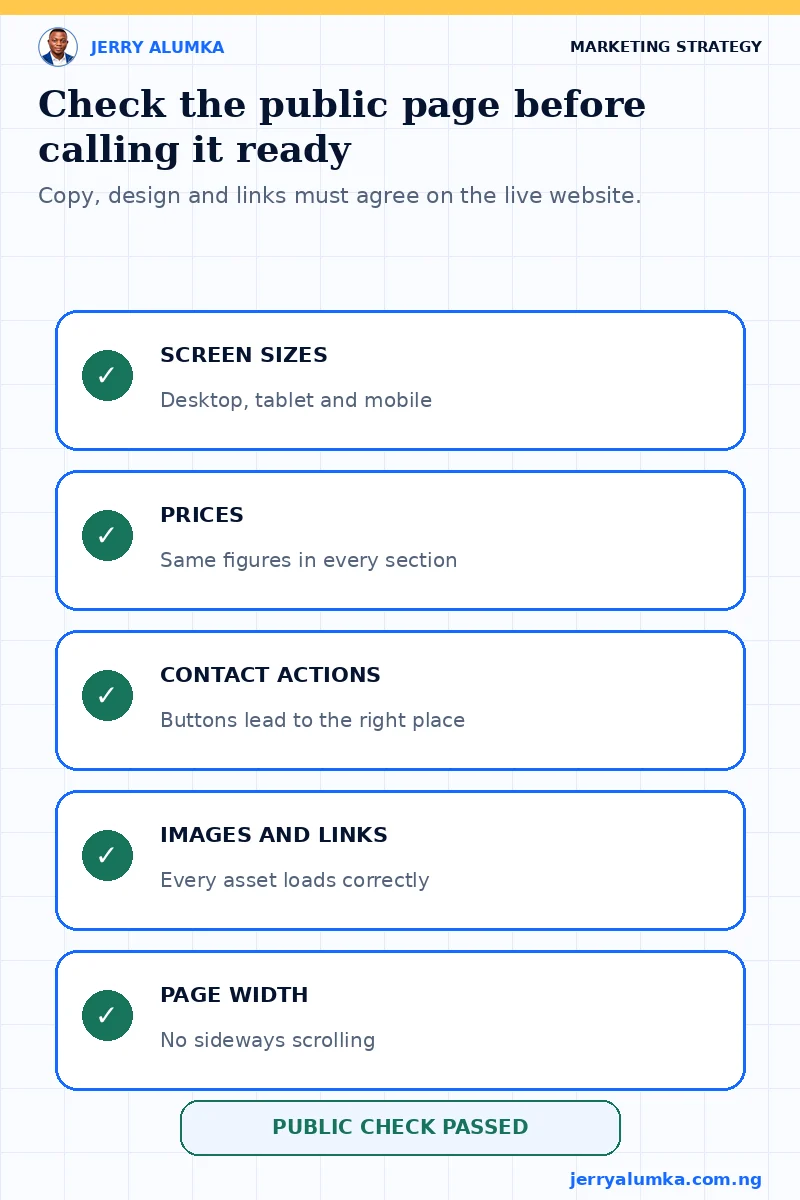
Once the offer was clear, I built and published the landing page. I checked the public page on desktop, tablet and mobile sizes. I also checked the price labels, page count, contact actions, images, links and horizontal overflow.
That final check matters because a simple offer can still lose trust through a broken page. If the mobile layout is crowded or one price changes between sections, the clarity in the copy disappears.
The lesson I am keeping is practical: simplify the decision before adding more persuasion. One defined outcome, one stable scope and one honest reason for the price difference gave me a stronger offer than a table full of artificial package levels.