
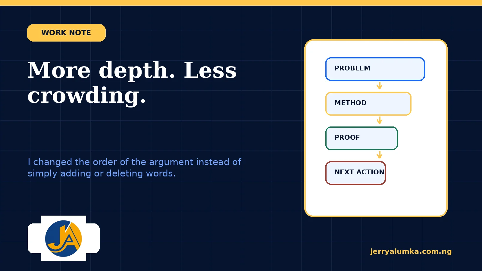
The page looked full, but the argument felt thin. Important details were present, several buttons competed for attention, and the reader still had to work out why the offer was worth choosing. So my feedback was not simply to cut it down. I wanted the argument to become fuller while the page became easier to take in. That meant looking beyond word count. The useful question was how much the reader had to understand at one time.
Why the page felt crowded
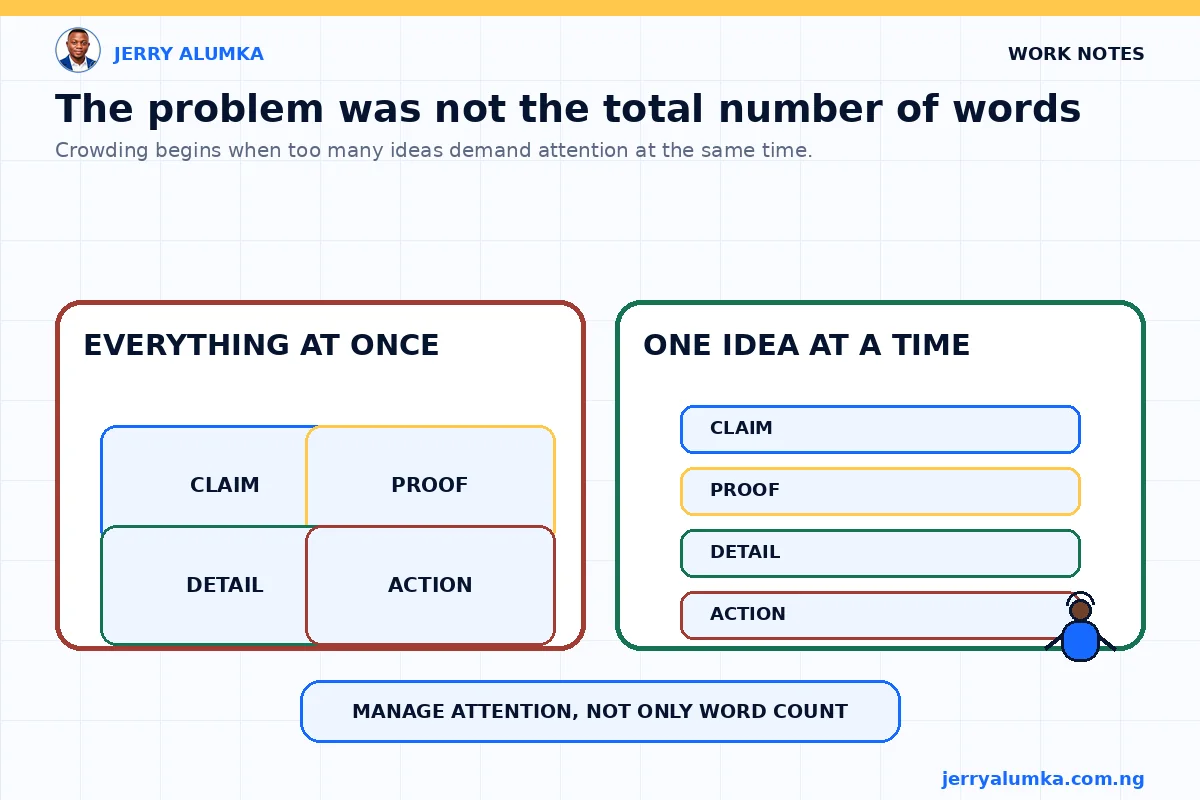
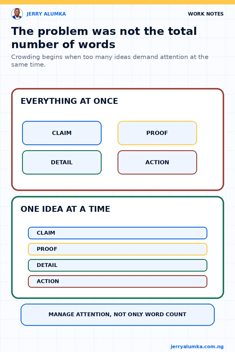
A long page can be comfortable when each section has one job. A short page can be tiring when claims, colours, buttons and instructions all compete for attention.
That was happening here. Important points and supporting details looked equally important. Several calls to action asked for attention at once. I needed to keep enough detail for a careful buyer while reducing what appeared at each stage.
The reader’s questions gave me the order
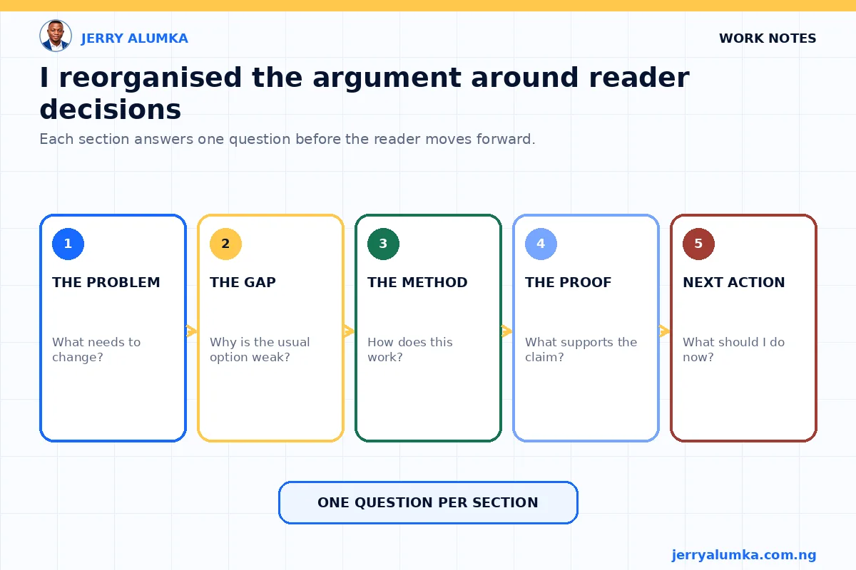
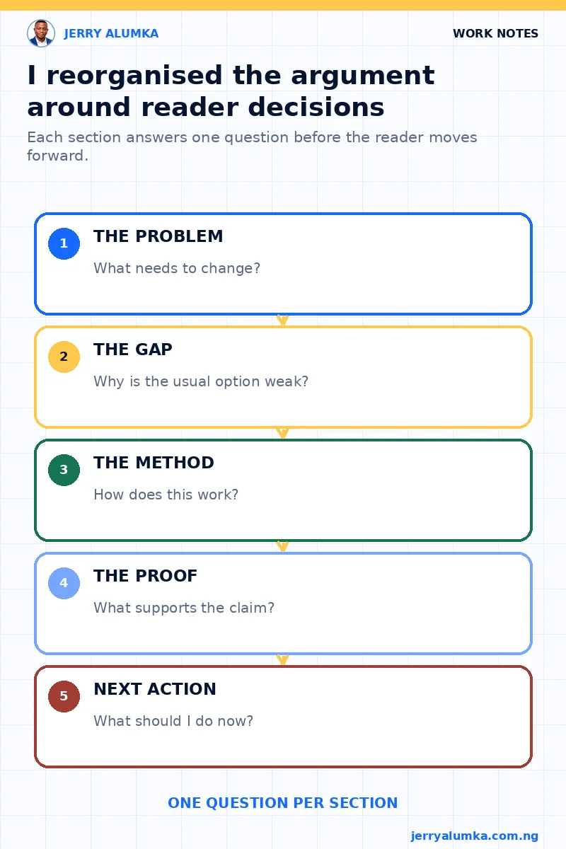
I arranged the page around the questions a buyer would naturally ask:
- What problem does this offer solve?
- Why may the usual approach fail?
- How does this option work?
- What proof helps me judge it?
- What should I do next?
Each section answered one question before introducing another. This also gave the design a clearer job. Colour could separate kinds of information, while pictures could explain ideas that were awkward in a paragraph. Supporting details could appear later instead of fighting with the main point.
The page still had many words. It simply stopped behaving like one large block.
Where AI helped, and where it did not
AI was part of the work, but an instruction such as “make this page better” was too loose. A system can polish sentences while leaving the wrong order in place. It can also add headings and boxes until the page becomes busier.
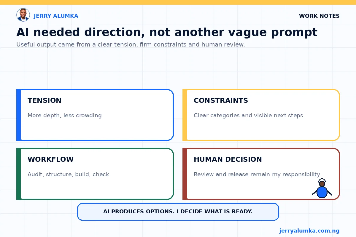
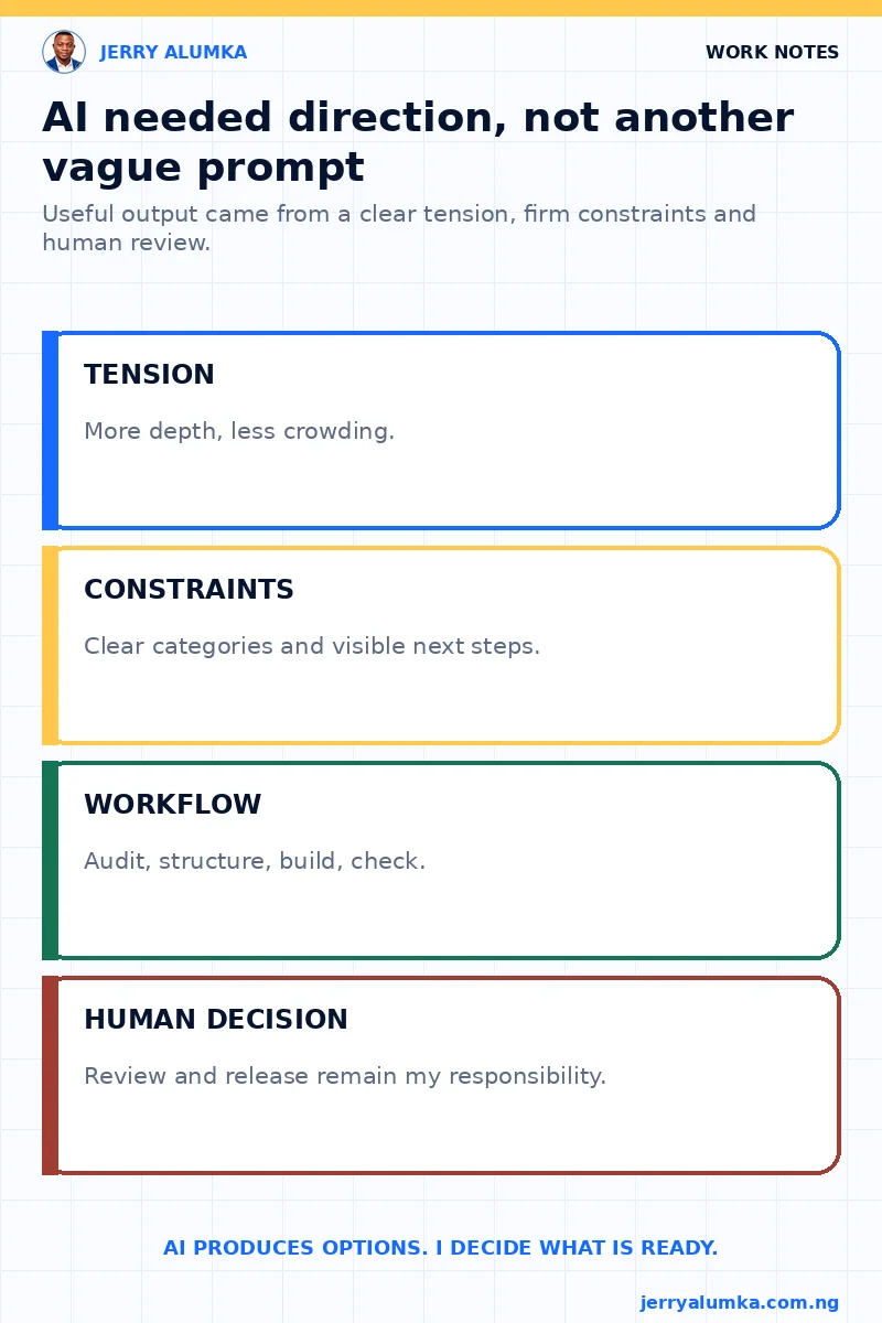
I gave it a more useful direction: keep the detail that a careful reader needs, reduce the number of ideas competing at once, make the categories easy to see and keep the next action within reach.
I separated the work into a page review, a new order, a test build and quality checks. The system could produce options. I still had to decide whether the argument was clearer and whether the result was good enough to use.
The redesign had a clear limit
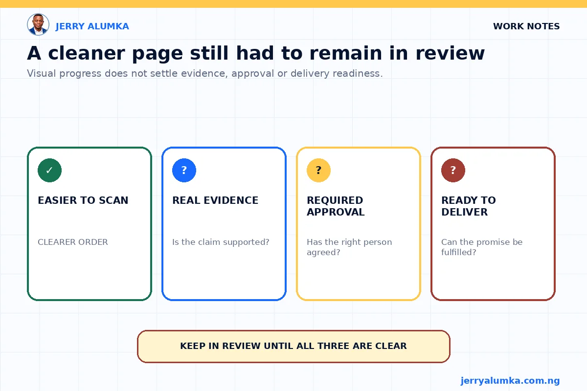
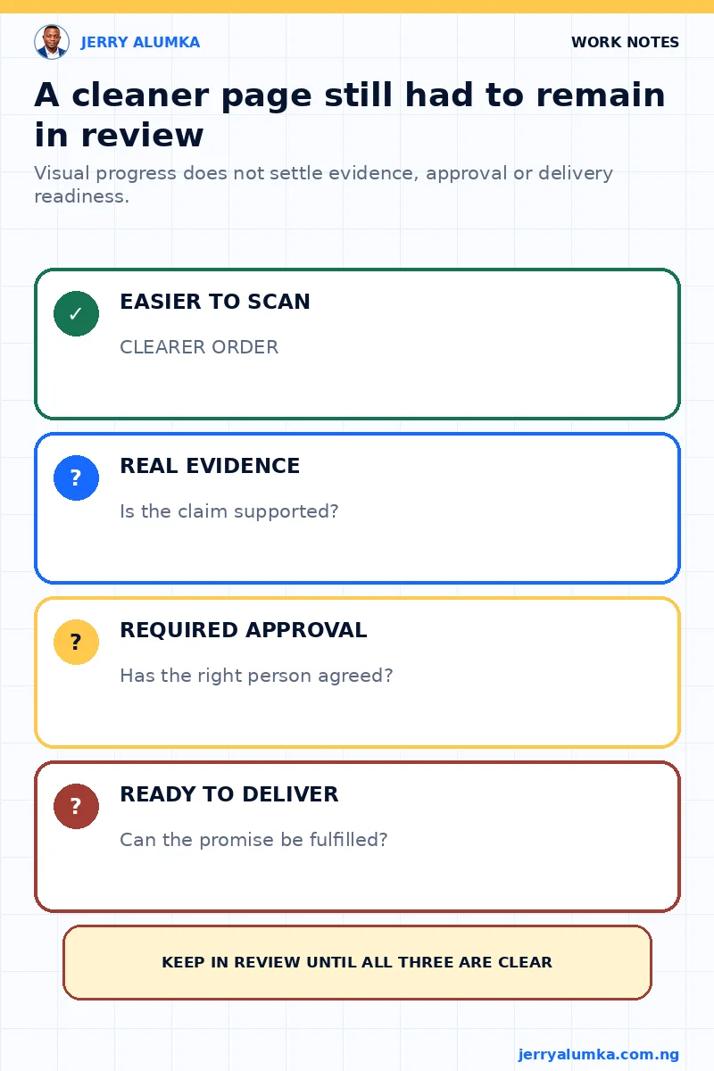
The revised page was easier to scan and the offer was easier to understand. That was an improvement, but it did not prove that more visitors would buy. Only real behaviour after release could show that.
The offer also needed approval, and the team still had to confirm that it could deliver what the page promised. Design cannot repair a weak service. I did not want a cleaner page to create false confidence.
Clarity was a better measure than length
When long copy feels crowded, do not begin by counting words. Find the ideas that are fighting for attention and put them in the order the reader needs.
Add detail where the reader needs an explanation. Remove what repeats a point or belongs somewhere else. The aim is to reduce confusion at each step, even when the page needs more words to make a sound case.